Creating the right interaction model to delight the customer
From the beginning, Navdy was intended to make interaction easy and effective while driving. In it's first crowd-finding campaign, Navdy demonstrated how voice and gesture control would be the key to delivering that experience. The challenge was, Navdy didn't have either technology in place.
TLDR;
Navdy was hell-bent on using gesture control and voice as the primary interaction model for their head-up display when I joined. I helped the team (especially the CEO), understand that this was going to destroy the product experience, and developed a new interaction model that relied on physical control first, creating a truly delightful product experience, and allowed a home grown gesture solution to shine.
A Day One to Remember
When I joined the Navdy team as UX director in 2015, the team was working hard to integrate gesture interaction technology, and had designed the product experience around the capabilities from their vendor.
In my first week at Navdy, we conducted a user test to see how we were doing, and frankly it wasn't well. We were testing with a flash prototype built by the design team, and which was controlled by me and other designers like a puppet. We would watch the actions of the driver from the backseat, and trigger events to match their movements. We wanted to see how the experience would feel to drivers, and even in these first tests we could see just how demanding it could be on a driver's attention.
Were we started with gesture
Our gesture system was built around three primary actions: gain attention, finger tracking, and selection.
- Attention - raising a single hand with pointer finger extended upward
- Track - moving the hand left / right once attention is gained
- Select - bending the pointer finger to 'click'
The original way the gesture system was used in reference designs was to provide gesture control for products like TVs and monitors, used indoors, with static subjects providing their full attention. When working well, tracking was very accurate, and most demos felt more like using a mouse to select items in menus as opposed to a traditional TV input like a DPad or arrows.
Early Progress
The team had quickly realized that fine tracking required high attention, and had developed a simplified control modal for gesture that cleverly broke input into 1-3 'zones' (depending on the application). Instead of gaining attention, and tracking over 5 or items, users raised their hand, and then chose center, left of center, or right of center.
The attract interaction was crucial, and so we developed clear feedback when attention was captured. If the product was in a driving mode (map or dash), Attract opened a modal 'quick menu', or if the driver was already in a menu, glance, or modal, then a cursor raised from below and highlighted the default choice.
Menus, Modals, Glances, and Alerts all conformed to this center / left / right interaction model.
The problems
- It was slow
- Required a driver's full attention
- Took hands off the wheel
- Confounded users - it was weird and uncomfortable for most of our drivers.
- It was unreliable and eroded trust in the product- Worked poorly in real-world lighting conditions, hands, and camera positions.
Solutions found, but not trusted
The team began looking for better ways to control Navdy, and built a series of prototypes from buttons, knobs and dials, to sliders and touchpads. We considered where they might work best, from the steering wheel to the dash and console. I took a handful of our favorites, and was immediately convinced that the dial form-factor, with rotate left, rotate right, and center button was the best for Navdy.
The Dial was the best option from a product perspective.
- Easy to place - small, flexible, and wasn't a detractor
- Easy to find - the driver could find the device without activating it.
- Fast - lightning fast, the driver could scroll through options and lists quickly
- Forgiving - it worked in any orientation, no matter where you placed it, or if the wheel was turned.
User testing to build confidence and break the gridlock
I knew we had the right design, but making a change this significant this late in the process wasn't the plan. I decided the best to give the entire team the confidence they needed to lean into the decision was to show them the difference in the product experience through the eyes of our potential customers. Our CEO was the hardest to convince, as he felt his reputation and Navdy's investors had already bet that gesture control would be incredible.
I decided I anted to run our most ambitious test to date. I would take participants through two sessions, one week apart, and train them to use Navdy with multiple interaction methods. In the first session we'd teach them how to use Navdy's most common features, and let them learn and use only the gesture interaction (because it was the most novel). In the second session we'd give them a refresher, introduce the physical controls, and them run them through a marathon of simple tasks using the various control modes. We'd see how users performed on the tasks, and then ask them about their experience, and to compare the interactions, ideally highlighting their favorite way to control Navdy.
The feedback was clear
Every driver preferred physical controls to gesture by a landslide. Gestured averaged 1/10 while physical controls ranged from 8/10-10/10, with almost no clear winner
Beyond that however people preferred the product more too.
With gesture we heard drivers say: "it doesn't work", "it doesn't see me", or "I guess it doesn't like me."
With physical controls, we heard drivers tell us how Navdy would fit into their lives, helping with commutes, keeping eyes on the road, and staying connected.
Now it was time to follow our intuition and listen to ourselves
Though our drivers didn't pick a clear winner for the final form factor of our controls, I knew what to do. We looked at what would be easy, fast, flexible, and aesthetically appropriate in the car. I knew that the dial was the clear winner.
The Dial was the best option from a product perspective.
- Easy to place - small, flexible, and wasn't a detractor
- Easy to find - the driver could find the device without activating it.
- Fast - lightning fast, the driver could scroll through options and lists quickly
- Forgiving - it worked in any orientation, no matter where you placed it, or if the wheel was turned.
- And as a bonus, we knew that with some slight modifications, we could make it work with our existing interaction model.
Outcome
We shipped Navdy with the Navdy Dial from day one, which was the best way to drive. We stopped our integration with an outside gesture vendor, hired some amazing people, and developed our own gesture system, which identified swipes to easy confirm or dismiss while driving.
A Day One to Remember
When I joined the Navdy team as UX director in 2015, the team was working hard to integrate gesture interaction technology, and had designed the product experience around the capabilities from their vendor.
In my first week at Navdy, we conducted a user test to see how we were doing, and frankly it wasn't well. We were testing with a flash prototype built by the design team, and which was controlled by me and other designers like a puppet. We would watch the actions of the driver from the backseat, and trigger events to match their movements. We wanted to see how the experience would feel to drivers, and even in these first tests we could see just how demanding it could be on a driver's attention.
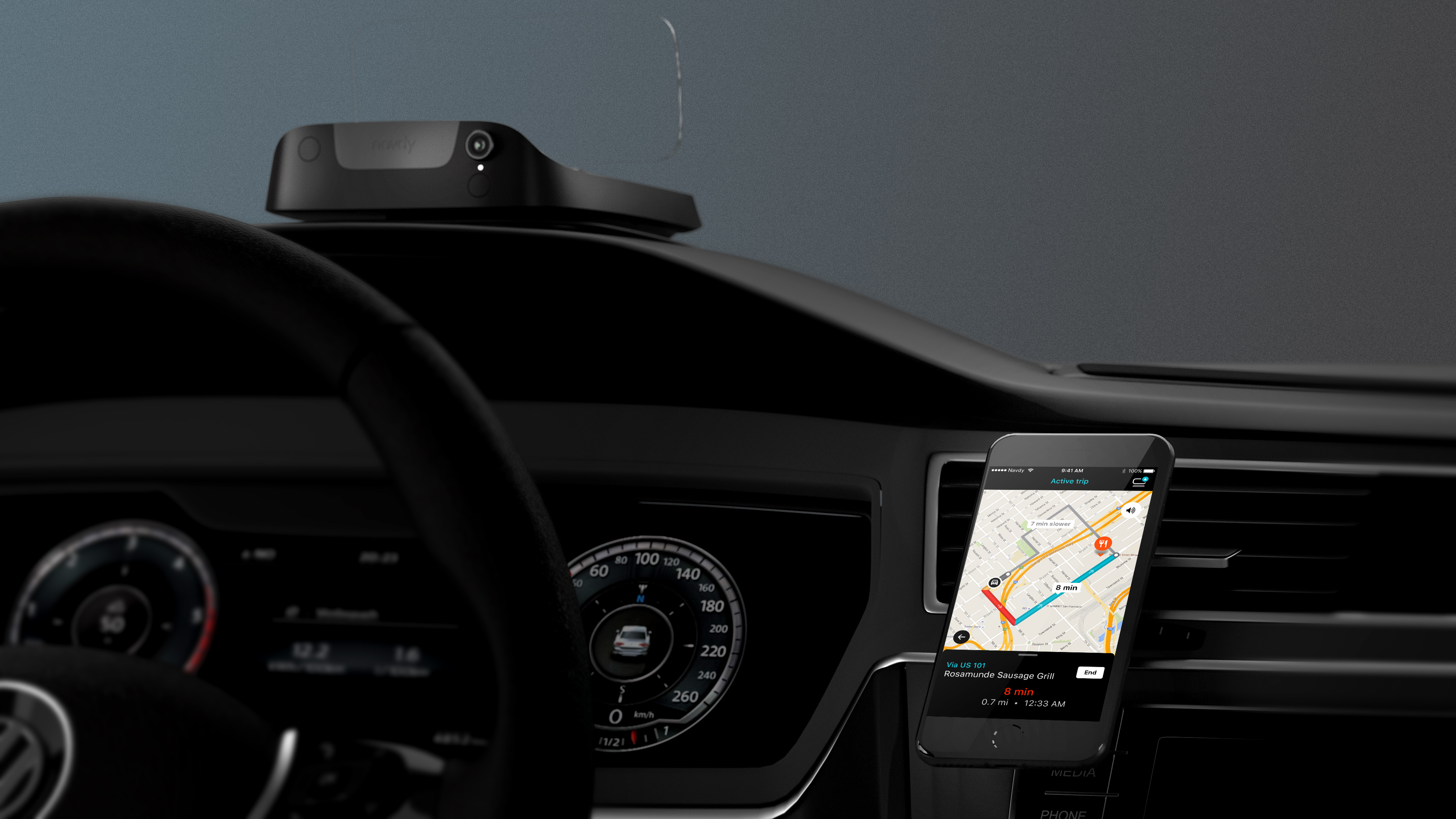
Fatalities and accidents are increasing in the US for the first time 40 years, largely due to distracted driving caused by drivers using their phones and infotainment systems. People generally report that they are safe drivers, but a majority of them admit that they use their phones while driving. Navdy set out to find a way to keep people connected without using their phones.
The Navdy experience was designed from the ground-up for drivers. It let drivers keep their eyes on the road, not their phone, while staying connected with navigation, calls, messages, and music.
We designed for these core experiences
- Help people get to their destination easily, safely, and on-time.
- Help people manage the logistics of their day, whether it’s families coordinating drop offs and pickups, sales people visiting their clients, or commuters getting to and from work.
- Help people stay connected, giving them the control to decide what information they want to see on their drives.
- Help people listen to music and podcasts they love on each trip.
A Day One to Remember
When I joined the Navdy team as UX director in 2015, the team was working hard to integrate gesture interaction technology, and had designed the product experience around the capabilities from their vendor.
In my first week at Navdy, we conducted a user test to see how we were doing, and frankly it wasn't well. We were testing with a flash prototype built by the design team, and which was controlled by me and other designers like a puppet. We would watch the actions of the driver from the backseat, and trigger events to match their movements. We wanted to see how the experience would feel to drivers, and even in these first tests we could see just how demanding it could be on a driver's attention.
- Help people listen to music and podcasts they love on each trip.